I finally had a chance to get my hands on the Nokia e71 and had hopes of making it my main device...and long story short, that isn't going to happen. But that decision says more about me, than about the device- I have realized that I don't just like Windows Mobile Professional, I love it. But, enough about me, lets talk about the device!
I opened the box and was immediately impressed by the look of it- Its a small, sleek looking thing and is unbelievably thin. However, one of the first things I noted was that it does not do well with fingerprints- in certain spots where my fingers had been it looked almost like it was tarnished with dark spots (which wiped clean, but still).
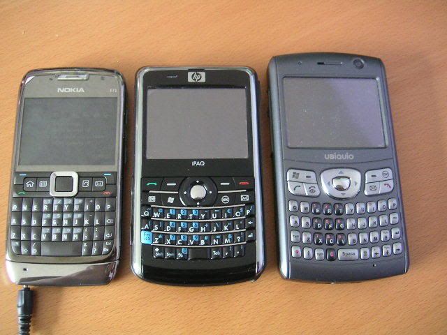
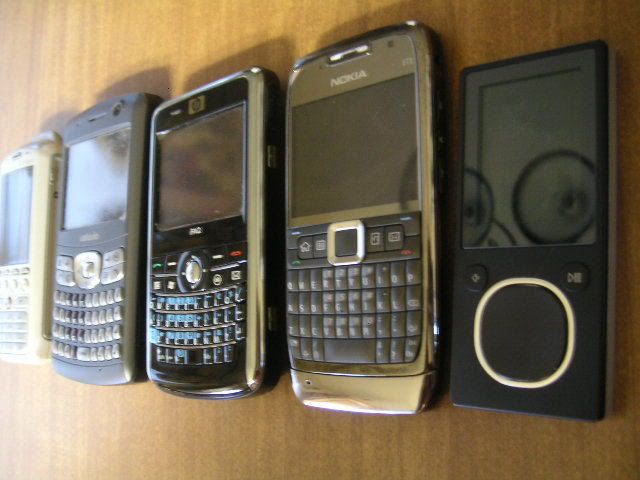
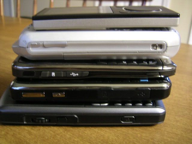
Physically, the Nokia e71 has a lot going for it. Its almost as thin as my Zune 8GB, and thats saying a lot:
Lined Up: TMobile SDA, Ubiquio 503G, HP 910, Nokia E71 and Zune 8GB
Stacked (Bottom to Top): Ubiquio 503G, HP 910, Nokia E71, TMobile SDA, Zune 8GB
The use of metal on the device is a double-edged sword: it looks amazing and solidly-built, however, the downside is that it can be hard on your hands after long use. I tend to hold my QWERTY device in a particular way which balances the bottom of the device on the insides of my ring fingers for balance, and type with my thumbs. For this reason, I love the HP 910 due to its smooth, curved bottom. The Nokia E71 has a bit of a sharp, angled bottom and digs a bit uncomfortably into my fingers.
Okay, so what's under the hood? The Symbian OS to me most closely resembles the Windows Mobile Standard- its non-touchscreen and not as robust as the Windows Mobile Professional version
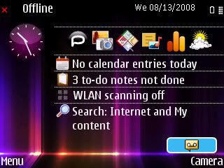
As someone who really enjoys customization, I felt a bit limited on the OS. I love to have a lot of information at-a-glance when I turn on my device- but I can't do that with the Nokia. Another pet peeve of mine is that the clock isn't visible in all applications, something which I find invaluable. Sometimes I can get absorbed in a game, or a book and just like to be able to keep an eye on the time without having to flip to the homescreen.
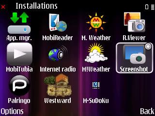
I could add a number of applications relatively easily, and they worked well. Organizing the folders and menus was a bit of an enigma to me though:
One thing that I loved though, was that Google reader provided a neat mobile version of its site which had a slightly iPhone-ish UI and navigation to it:
I'm not going to bang on about everything that has been covered extensively in other reviews: the camera is quick, but has a purple tint. The video player is okay, but stuttered on some videos I played. The music player works well, but didn't sync playlists from Windows Media Player, and some album art was missing. The volume was very loud, but I felt that the metal back interfered with the quality at times. Battery life was ridiculously long, even without conditioning- I wish Windows Mobile devices could find the secret sauce to make the batteries last so long.
Yesterday evening my husband handled the device for a bit, and was very impressed with the build quality and intrigued with the device. I realized that the Nokia is a natural progression for him- he currently uses the TMobile SDA with Windows Mobile Standard so this is one thats thinner and more mature than his. (But he likes a more hardy phone, and wouldn't use more than 2% of the functions!)
All in all, its a great device, but I would have a hard time making the switch to the Symbian OS. And the hardware, while attractive, is a bit too hard for me- odd to say, but I prefer plastic. And so, I packed it up and back it goes...and I am glad to have satisfied my curiousity. I think most WM Standard users will be able to make the transition smoothly- WM Pro users, not so much.
No comments:
Post a Comment